One system, every franchise: bringing coherence to EA Play
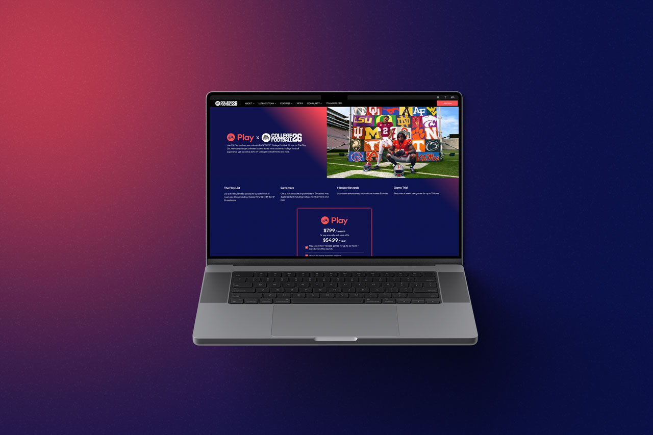
The 30-Second Version
A quick note before you keep scrolling
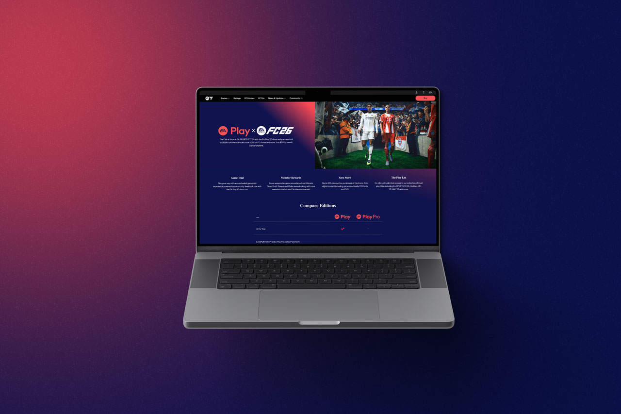
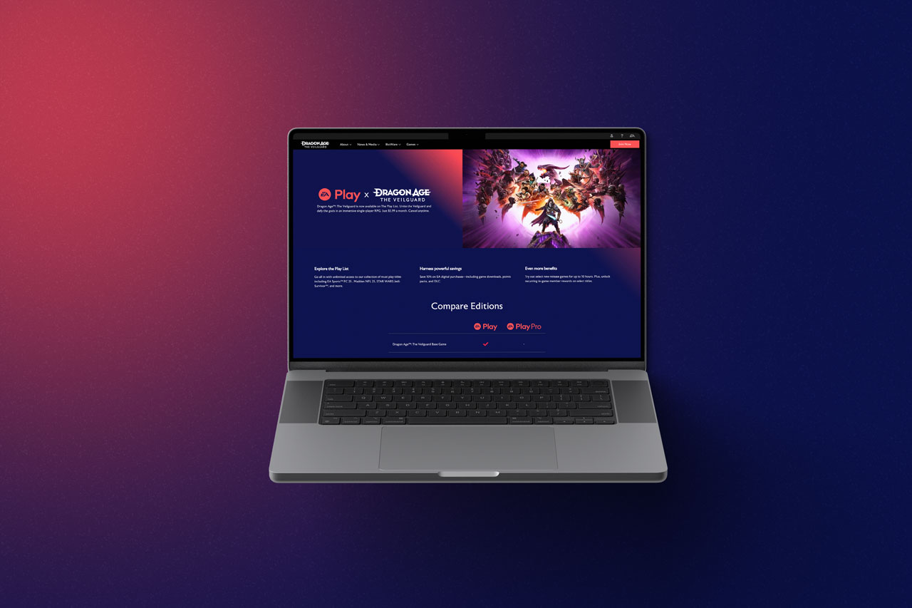
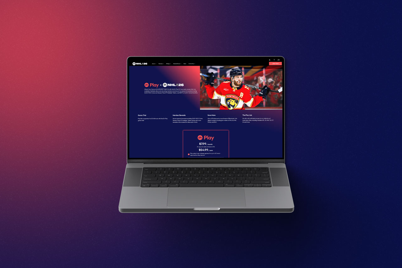
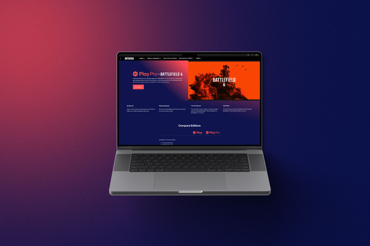
Every EA franchise (Battlefield, Apex, FIFA, Madden, and more) designed its EA Play subscription messaging on its own, which diluted the value of membership and left players with inconsistent purchase paths. I audited every active entry point, then built a component based framework flexible enough to sit inside any franchise's existing layout and adapt in real time to a player's subscription state. I built the front end myself in HTML, CSS, and JavaScript with AEM conditionals, so franchise teams could deploy it independently. The core patterns were later adopted into the EA Play homepage itself.
I Owned
- UX architecture & cross-franchise audit
- Component system design
- Front end build (HTML, CSS, JS, AEM conditionals)
- Implementation documentation for franchise teams
Built Alongside
- Franchise teams
- Engineering: AEM integration and QA
At a glance
Dozens
Franchise sites unified
Under one component system, replacing independently-managed, inconsistent implementations
0
Adopted into the EA Play homepage
Core patterns proved durable enough to become the platform standard
Zero
Added engineering overhead
Franchise teams could deploy components independently, with documentation, not custom builds
Outcome
The fragmentation problem
It wasn't a UI problem. It was a coherence problem.
Subscription touchpoints varied wildly across franchise pages. The cause wasn't inconsistent visual taste. Every team owned their implementation independently, with no shared source of truth. That fragmentation diluted the actual value of EA Play membership and created confusing, inconsistent purchase paths for players.
Before proposing any design, I audited existing platform analytics, prior user research, and stakeholder insights, and mapped every active EA Play entry point across franchise pages to understand how user intent shifted page to page. That research made the fragmentation concrete. It was a structural problem, not a style one: the same subscription decision, presented differently, everywhere it appeared.
One system, many contexts
Built to work everywhere, adapt in real time, and scale without custom engineering.
The system had to integrate into vastly different franchise layouts, dynamically adapt to a player's real-time subscription state, and scale globally without needing custom engineering support for every title. I tested modular content hierarchies through whiteboard sketches and low-fidelity wireframes. Rather than designing standalone pages, I built a flexible, component-based framework that could sit naturally inside any franchise's existing ecosystem.
The system evolved through cross-functional reviews, accessibility audits, and QA testing against lifecycle logic, refining until it reduced cognitive load, clarified tier value, and behaved predictably across breakpoints. Every refinement was validated against AEM's technical architecture.
From design to shipped code
Owning both sides of the handoff to protect the system's integrity.
I handled the front-end implementation directly. I built modular templates in HTML, CSS, and JavaScript, and configured AEM conditionals to dynamically serve content based on a player's active membership tier. I delivered implementation documentation that let franchise teams deploy the components independently, with zero added maintenance or design bottlenecks on my end.
Owning UX architecture and front-end development together removed handoff friction entirely, and let the system stay faithful to its original intent as it scaled. Most design systems drift once implementation gets handed to someone who wasn't in the room for the original decisions. This one didn't.
Outcomes
The clearest validation came when the core component patterns from this project were adopted into the main EA Play homepage. That's proof the system held up as a durable, platform-wide standard, not a one-off franchise fix. Bridging design and code enforced strict visual consistency and produced a framework that continues to scale across the global ecosystem without added engineering support per title.


Reflection
This project reinforced how I think about scale: consistency isn't enforced by a style guide alone, it's built into the system's technical logic so teams can't easily drift from it, even unintentionally. Owning both design and front-end implementation meant the framework could stay coherent as it spread across dozens of contexts I'd never personally review page by page.
Thanks for taking the time to explore this case study ✨
You may also like
A quick look at how that same problem-solving shows up across AAA games, SaaS, and marketing.
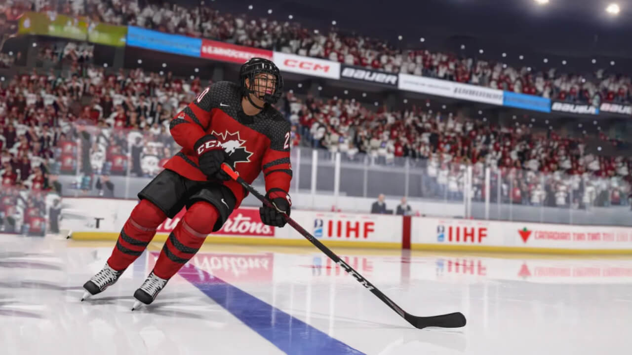
NHL Live Ops
Rebuilt a Photoshop-based content pipeline into a Figma system for daily/biweekly live-service drops, cutting turnaround and errors.
Read case study
ProtoPie's Website Redesign
Led UX and visual design for the marketing site rebuild in Framer, unifying a fragmented component system.
Read case study
Gears of War Esports
Graphic and motion design for in-game events, challenges, and cosmetic drops.
Read case study